Sunday, September 16, 2012

And That's What It's All About


The invitation above is a very special one.  Usually I blog about wedding invitations, shower invitations, and then sometimes as a result, baby shower invitations.  Well, this invitation tops them all, it is an invitation for a 55th wedding anniversary - how cool is that?!  To top it off, the invitation was created for my grandparents wedding anniversary and it was so special.

The invitation featured a wedding photo and the entire thing was printed on silver cardstock.  The overall invitation looked very regal.


Below is a birthday party invitation for a special little girl.  I have created her birth announcements, 1st birthday invitations and now her 2nd birthday invitations!  I love that I have clients that keep returning, it is so fun to work with someone over and over and be a part of the milestones in their lives:


Below are two recent letter art creations that I made.  This customer had me make these as wedding gifts and anniversary gifts.  What a thoughtful and special gift:


Monday, July 30, 2012

Vintage Love

Last weekend I had the honor of standing up as the matron of honor in my cousin's wedding.  What was even more special about this event was that the reception was in my yard.  For a year I worked closely with my cousin to help plan and create lots of personal and special details to make their wedding day personal, special and fabulous.

Their theme consisted of a mix of rustic elements and vintage elements combined with a lot of though.  Below are some photos of the stationery for this fabulous event:


For the bachelorette party, we wanted to do something different.  We were tired of the same old bachelorette trip to the bar and wanted to do something a little more mature and personal.  We came up with the idea of a "cork and canvas" night - basically a wine night featuring some art projects!  We started our evening at a local winery and had a wine tasting, then went back and drank more wine and painted a large canvas for the bride and groom.  It was tons of fun, personal, unique, and now they have a cool piece of artwork to hang in their house.

When designing the invitations for her party, I wanted to stick with the wedding theme and give them a vintage feel.  And of course, because the party was going to be so cool, the invitations had to be rather fab!  I designed the invitations using a light silver metallic stock and mounted them on ivory stock.  The overall design featured a text heavy design with just a few framing elements to enhance the design.  I was so very happy with the final product and I loved how the coordinated so nicely with the wedding invitations and overall theme.


The invitations for the wedding were not just invitations - they were a work of art!  The invitations were printed on gray cardstock, with gray text and the names of the bride and groom printed in a bluish gray color.  Wrapped around the gray stock was a piece of lace.  The RSVP cards mirrored this look with the ivory stock on top and gray on the bottom.  The overall package was wrapped with rafia and man oh man did it look nice.  As a finishing touch, A personalized return address stamp was used on the envelope and guest addresses were printed on the envelopes:


For the wedding day I created lots of items including programs, menu cards, favor tags, signage and more:

Programs were printed on ivory paper with dark gray ink.  A vintage frame outlined the names of the bridge and groom and I used the same font for their names on the program that I used on the invitations.


The menu cards featured the same vintage frame and gray and blue text.  They were tied with rafia to mimic the invitations.  The invitatins were tucked into the napkins and were placed at each place setting.


The wedding decor was so cool.  Our grandmother had tons of old blue ball mason jars that were used as flower vases.  The vases sat on top of a slice of a walnut log.  The flowers were GORGEOUS.  Emily Ryers of Ryers flowers always does such nice work and this event was no exception.


Ryers flowers created this gorgeous floral arrangement that sat in front of the mailbox that doubled as a card box.  On each side of the mailbox featured a sign with the new address of the bride and groom:


The wedding favors were a DIY project made by the bride.  They were birdseed ornaments that each guest was to take home.  I created the sign that sat just above the favors:


The favors sat in front of a gorgeous vintage trunk and sat in a delicate bird bath - it was such a great way to display them!


Favor tags were created and strung to each favor:


In lieu of a guest book, the bride had small wooden discs that mimiced the look of the stumps that the flowers sat on.  Guests were encouraged to write words of wisdom to the bride and groom.    They then kept these in a basket and plan to display them in their home.  I created the bunting strung to the front of the basket, tied with rafia.


What I loved most was this personal display of family wedding photos.  The table featured photos of parents, grandparents and great-grandparents, all in a variety of vintage frames.  I have seen this at several weddings and it is such a nice touch.  Plus, the display adds something personal and beautiful to the wedding decor.


And here is one last photo of the menu cards, I loved them so much!


Overall the wedding was gorgeous.  Guests drank out of mason jars, paper lanterns hung from the trees and twinkled at night.  The weather was perfect, the bride was beautiful, the groom handsome.  All in all it was a perfect day and a perfect memory.  Cheers to Ryan and Trish!

Wednesday, July 18, 2012

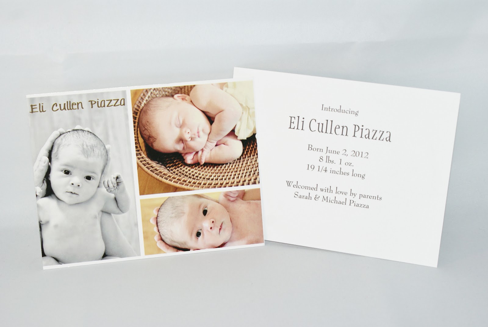
Introducing.....Eli!

I am so excited to finally create this post.  6 weeks ago my husband and I were blessed with our son, Eli.  He is the sweetest little thing and we are so grateful to have this healthy, loving and wonderful baby boy.

I am so excited to share his birth announcements with the world.  Elizabeth K Photography took his newborn photos and man oh man did we end up with a lot to choose from!  In the end, I chose 3 images to use on his birth announcement.  I ended up creating 4x6 glossy announcements with his photos on the front and stats on the back.  I thought the final product was so perfect, but then again, I am rather biased :)


When we got his newborn photos taken, I ordered a book with all of his photos.  I knew there would be too many to choose from to print, and I was right.  Libby created this awesome, awesome, awesome hardcover book - one of the best purchases I have made!


And here is a sneek peak of the inside of the book:

Isn't he just precious?!


Well, that is all of the blogging I have time for today, duty calls!  Stay tuned to my next post featuring a rustic vintage DIY wedding - you will love it!

Wednesday, May 23, 2012

Summer is Around the Corner

One of the things that I love most about creating stationery for summer events are the colors.  I love color - I love fun color combinations, bright and cheery hues and love to experiment.  The next few items all fit perfectly into that category and I am very excited to share them:

This first wedding set I just love.  The first photo shows the whole package - the invitation and RSVP card are wrapped up with a paper wrap, showcasing the wedding date.  This invitation is bold and graphic yet still made elegant with small touches such as metallic paper and subtle watermarks. This invitation set was designed for a very special friend and I am so happy that it turned out as fun as it did.  The bold teal matting and fonts are a great match for the metallic ivory stock that the invitations were printed on.  Another thing I loved so much about this invitation set was the RSVP card - if you know anything about the bride you know that she is all about having a fun time.  The RSVP card reflected this completely by forgoing the traditional RSVP wording and adding some spice with options like "Wouldn't miss it for the world" and "Will be there in spirit".  Then, at the bottom, guests have the opportunity to send in a song request for the reception.  How cool is that?!

All in all, these turned out great - I am very happy for this special bride and groom and I look forward to celebrating with them!


I have blogged a few times about Erica's wedding elements - I have shared her save the date cards and shower invites and now it's time to share the real deal, the wedding invitations!  I love, love, love the colors of Erica's summer wedding invitations.  The navy blue, fuschia and lime green are such a great color combination, nothing says summer better than a color scheme like that.  This design was also created just for this bride and I really am loving the final product.  I feel like the design is delicate, yet graphic and bold at the same time.  This design has been done for quite some time because the bride is just about the most organized person, ever.  She is so on the ball, if I had an ounce of her organization I would be doing well!

I am still trying to name this new design, so check it out and send me your suggestions:

This wedding set used the design, Delicate Floral, but changed the colors to a very fun light pink and celery green color scheme.  Again, loving the summer colors!  This bride and groom had two RSVP card options and they were both hilarious and fun.  I love the fact that people are putting some creative and personal ideas into their invitation wording and foregoing traditional ettiquette. 


What I love about this invitation is the choice of font that the bride made.  This wedding is small and casual and I think the informal, handwritten look of the font, coupled with the color scheme, perfectly portray that.  The design that we started with was "Sour Apple" and their colors and font choice certainly added a personal touch to this invitation:

Next up is a unique and fun bridal shower invitation.  I love the contrast of the yellow trees in the photo with the pool blue text.  Subtle yet effective.  This invitation is great because it showcases the couples adorable engagement photo, which I think is a great idea!

And finally, I get to share something that I have been so excited to blog about.  The bride and groom recently tied the knot on Anna Maria Island in Florida (Congrats Mandy & Duane!).  The wedding colors were shades of teal and blue (again, LOVE the rich, bright colors).  The bride had found a thank you card on pinterest and we used that for inspiration.  They wrote a personal thank you note to their guests and I printed these 5x7 cards that were placed at each place setting.  I used 4 different fonts and am head over heels in love with the final product!  From the colors to the composition, this item is one of my new favorites :)

Now my hope is that my next blog will be featuring the birth announcements of my baby boy, who is due in 4 days.  I am very impatiently awaiting his arrival, and cannot wait to meet him very soon!!

Sunday, May 20, 2012

Showers, Showers, and more Showers!

As we know, wedding season is in full swing - and so is shower season!  These days it seems that themed and unique showers are all the rage, which as a guest and as a host, I feel makes them a lot more fun to attend and plan.

This next invitation was for a colorful spring shower - you can get the bright and cheery feel of the shower right away from this vibrant invitation:

The next shower I was a co-host of, so I have a lot of fun details to share.  This was a Kentucky Derby themed family party that was held in lieu of a traditional shower.  The invitations were printed on white metallic paper, mounted on lapis metallic stock and featured a muted photo of the famed Twin Spires of Churchill Downs.

Held on the day of the Kentucky Derby, I completely went all out to theme the event accordingly.  Thanks to the wonders of the Internet, I was able to find loads and loads of KY Derby paraphernalia ranging from balloons:


to horse wall clings:


Logo napkins featuring the Derby 138 logo:


This was a gift that was just too cute - it was a Kentucky Derby package featuring bluegrass seeds, Derby pie, Makers Mark and more - it was so fitting!


A pair of Derby 138 glasses for the bride and groom to keep:


Disposable 138 glasses:

And what is a Kentucky Derby party without horses or betting?!  We set up bags for each contending horse and guests could "place their bets":

 We had "official" betting slips:

And the winner won this Derby movie night basket featuring popcorn, movie candy, the movie Secretariat and a set of 138 Derby glasses:


And, since the race is called the "Race for the Roses", these adorable cupcakes were made (not by me of course!):


The same baker also made these horse cupcakes - trust me when I say that the photo does these cute little things no justice at all:


And to top it off, my uber-creative Aunt, the one that made me the cement truck diaper cake in my previous post, made this little number for the bride and groom.   How cute is that?!

Monday, April 23, 2012

Diaper Cakes are a Thing of the Past

Recently we were blessed with another family party - we were thrown a wonderful diaper shower by our family and recevied many necessities.  One thing we got just takes the cake and I had to share it.  Rather than make a typical diaper cake, my Aunt Pam really stepped it up an notch and made us this:

It is a diaper cement truck!!!!  Our baby's bedding set is little boy construction and his daddy is a mason, so this was perfect.  Such a clever idea and I thought it was just too cute not to share.

Friday, April 20, 2012

She's Ready to Pop!

Recently, my mom, sisters, and aunts threw me the cutest baby shower. They had found the "She's Ready to Pop" theme on pinterest and ran with the idea. I love, love, love fun projects and events like this, therefore it was very hard for me not to get involved! I was able to design the invitations and left the rest up to them. Here are some of the highlights of this adorbale, thoughtful and all around awesome day:


I have a love for bright cheery colors, so I had to make these invitations colorful. I wanted the invitations to fit with the "POP" theme so I added some bubble looking graphics to the invitation. The final look was a bit retro, a bit funky, and all around cute:


The shower featured the cutest "POP" bar - it was sort of a take on a candy buffet, featuring all items that used the word "Pop".  There was POPcorn, POP rocks, cookie POPS, Ring POPs, and Rice Krispie Treats because they Snap, Krackle and POP!  The display, the ideas, the colors, everything looked so nice, they did such a great job!!


 The other shower details were just as awesome.  Again, I love color, and my sisters were sure to highlight that in the decor.  The tables featured pastel colored napkins in green, yellow, and blue.  At each place setting was a favor - a bag of microwave POPcorn with my expected POPPING date on the label.  The cetnerpieces were lolliPOP topiaries and each table had balloons that guests got to POP in order to see if they won a prize.  Every detail was so thoughtful and cute!

And I do have to share one last Pinterest idea, though it was not related to my shower at all.  Earlier in the year when my husband and I found out our baby's gender, we invited our relatives over for gender reveal cupcakes.  The idea was so fun: